Telling the Design Story
- grace mcknight

- Mar 22, 2022
- 2 min read
Updated: Apr 5, 2022

Group Growth
After a serious discussion with the group about the branding development progress we finally got The Mill Logo finished. With a week before formative, we started gathering all our work together to import it into a final presentation. We decided that each of us we speak about our own discipline sections. After a very long 3-hour video call we went through finalising each slide and run throughs, so we were all prepared for the formative assessment.

Personal Growth
This week was hard work with certain members not pulling their weight I found myself doing two peoples work which put my own work behind schedule. After seeing some flaws within The Mill logo development, I did some secondary research about Sir Richard Arkwright an entrepreneur in the Industrial Revolution. This hurdle was hard to overcome however, I had to think of the bigger picture and because one area was clearly weaker than the rest the other co-leader and I discussed that we needed to support the member a bit more by being a bit clearer in what the logo needed to look like.

Research
This weeks research was primarily 3D based with the interior layout now set the 3D visual was what needed work. After careful consideration of which visual styles, I proposed a more realistic internal visual that would complement a hand drawn exterior visual. This hand-drawn exterior reflected the brand whilst exploring the brand Made in House and the meaning behind the saying. However due to some technical software issues the hand drawn visual was not ready for the formative so we opted for the sketch up model version.


Fig 2,3,4
The 3D internal visuals were drawn up in SketchUp as this is for me the most effective 3D visualisation tool. After playing around with texture and colours I had a clearer view of the space. Even though it’s not as realistic as I would like it to be there wasn’t enough time to produce a realistic visual before the formative.
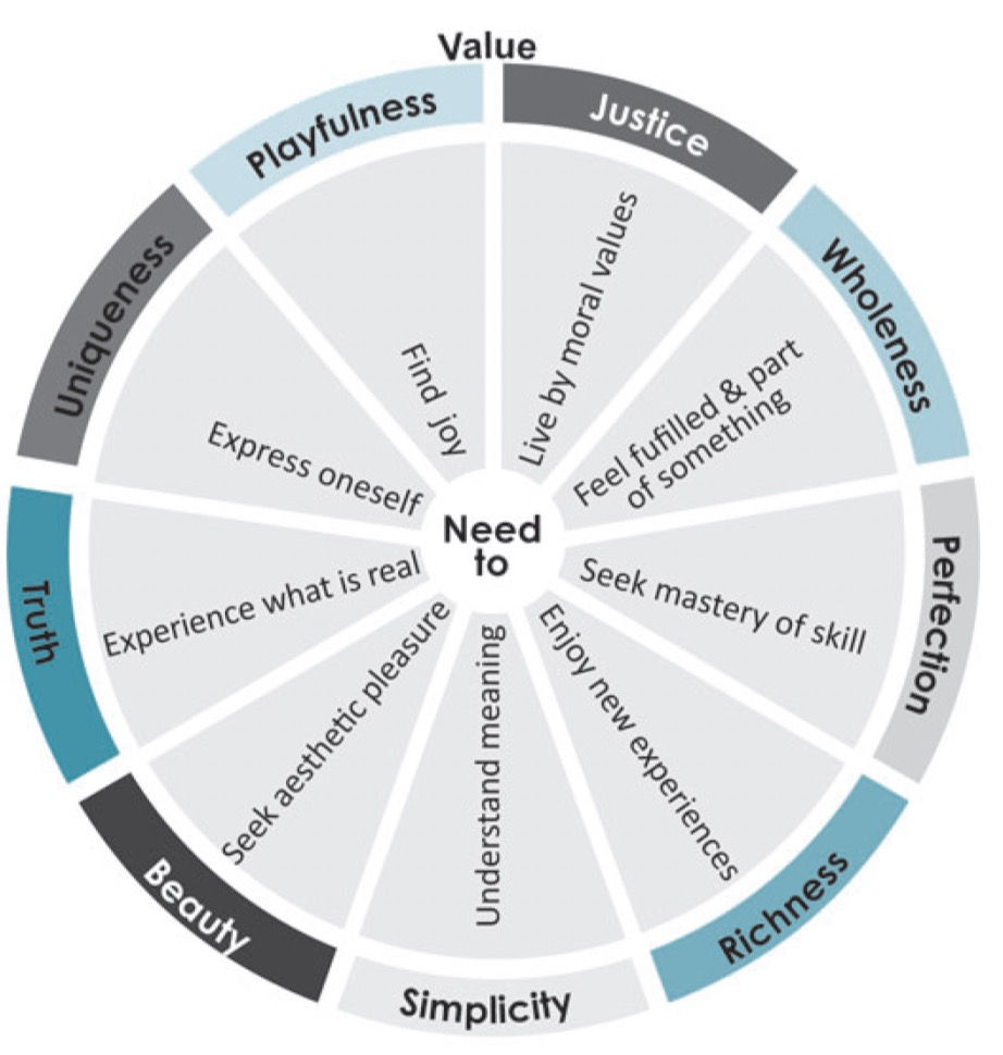
For our presentation we kept it simple taking techniques from Phil and Dr Leigh Morland lectures and the book Telling the design story (Huber, 2017). By combining both approaches it has allowed me to produce a comprehensive text that clearly focuses on the important parts of the projects. By eliminating the filler text and taking most of the text of the presentation has allowed for a more persuasive proposal. Seen in fig 5 the infographic (Huber, 2017 p.11) depicts general focuses, I believe that our project sits in the simplicity and wholeness sectors. I feel that we now have a good comprehensive presentation for the formative assessment.


Comments